How to Choose a Blue Abstract Painting That Holds Air, Not a Cold Wall
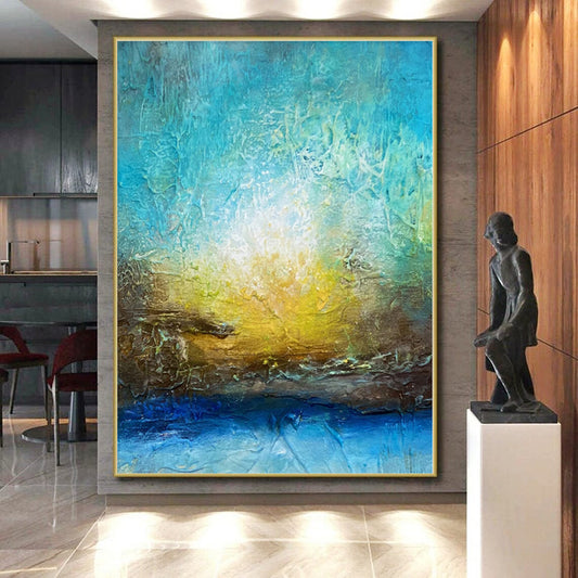
Blue on a wall fails when it is only temperature. A flat navy slab can make a north room feel like a waiting area. What lasts is air: a cooler band against a warmer ground, a mist that still has a ridge, ultramarine that has somewhere to stop. This guide is for hand-painted Blue Abstract Painting on large canvas—coastal fields, blue-gray mist, gold-and-blue cities, textured waves. It is not for a printed sky, and it is not for a monochrome that ignores the light you already have.
What painters did with blue
Yves Klein treated blue as space, not as illustration. Blue Monochrome (1961) at The Museum of Modern Art is a single field meant to be entered, not read as water. Untitled blue monochrome (IKB 82) in the Guggenheim collection holds dry ultramarine so the pigment stays raw. IKB 79 (1959) at the Tate is the same argument at another scale: blue as air, not as a picture of the sea.
The buying translation is practical. A canvas that only says "ocean" will date like a postcard. A canvas that says "cooler air against beige or gold" can live with a sofa.
Read the blue before you read the title
This collection is large. Titles wander into cities, waves, and mist. Sort by the kind of blue, then by how much else is on the field.
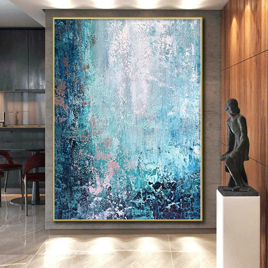
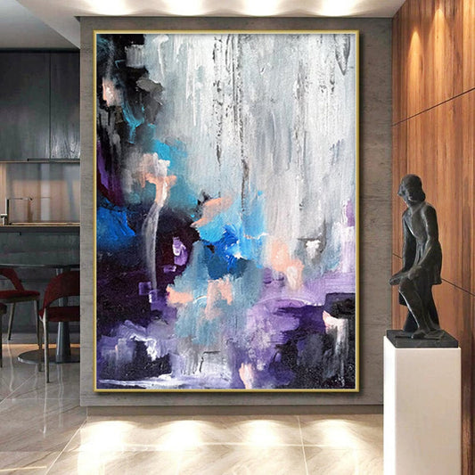
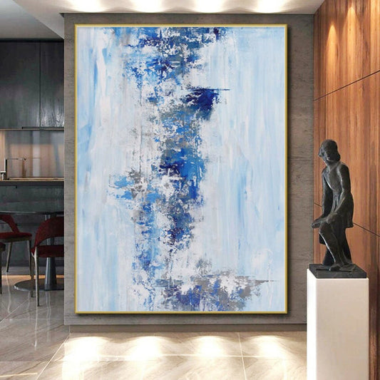
- Blue-gray mist is the most livable. It sits with oak, linen, and plaster. It works after the lamps come on.
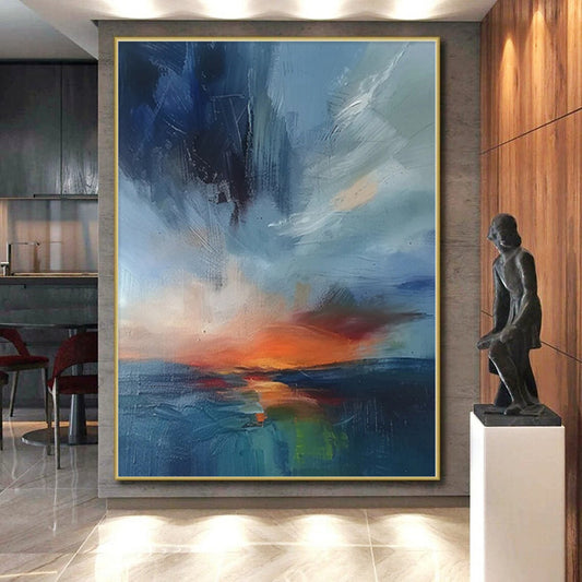
- Blue, beige, and gray coasts need enough beige in the lower third or the wall will feel wet and cold.
- Navy fields are architectural. They want warm wood and dimmable light. Next to cool gray paint they go dead.
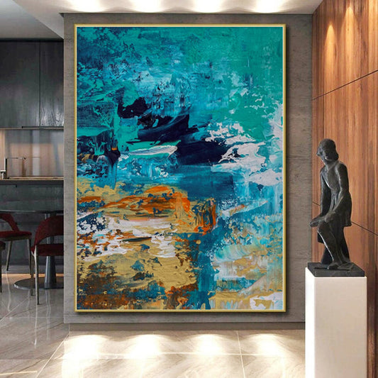
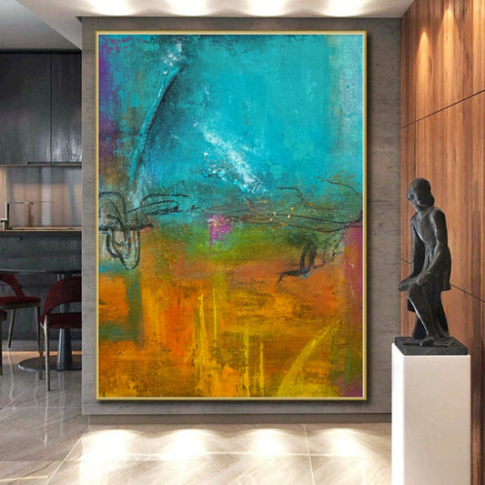
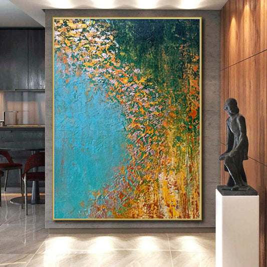
- Teal and turquoise read as water and mid-century. They clash with terracotta sofas unless you want that argument.
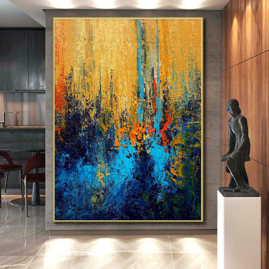
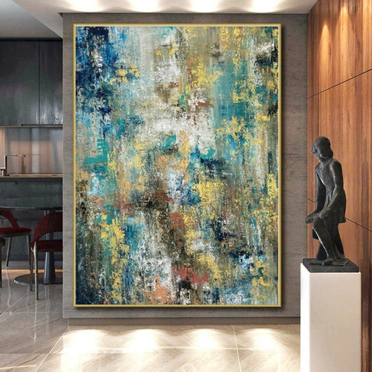
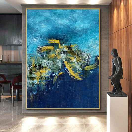
- Blue and gold is the city-night mix. Gold should be a vein or a reflection, not a second painting glued on.
- Powder and periwinkle suit bedrooms. They disappear on a white wall if the canvas is small.
Ask whether the blue is a climate or a subject. If you need the word "beach" to explain the work, you are buying a landscape. If the blue still holds after you ignore the title, you are buying temperature.
Rooms and the light you cannot change
North rooms already throw cool light. A navy field there will feel like shade. Use blue-gray mist or blue-beige coasts with a warm ground. South rooms can take clearer ultramarine and teal. East rooms change through the day; a blue-beige field looks cooler at breakfast and warmer at night. West rooms at dusk will heat gold-and-blue work and flatten a pale powder field.
Living rooms take wide horizontals: mist, coast, open blue-gray. Aim for 60–75 percent of the sofa width. A 90-inch sofa wants roughly 54–68 inches of canvas. Leave 6–8 inches above the cushions. Keep the visual center near 57–60 inches from the floor on an empty wall.
Bedrooms take powder, mist, and muted teal—not a high-chroma city reflection opposite the pillow. Offices take navy bands and blue-gold geometry; they look like structure. Halls can take smaller textured blues because you pass them at arm's length.
Warm, dimmable lamps (about 2700–3000K) keep navy from going black and teal from going pool-tile. Cool overhead LEDs are the usual reason a blue painting looks cheaper at night than it did on a phone.
Size, surface, and what not to pair
Horizontal formats carry air. A tall blue slab can feel like a doorway of water unless the composition is a field with a stopping edge. Oversized single canvases beat a row of small "sea" panels.
Texture helps blue take light. A knife ridge or a built mist will change as you walk. A perfectly flat print of blue will not. Gallery wrap with painted sides is the cleanest edge. A heavy gilt frame adds a second sun and fights the air.
Do not hang a teal wave next to a rust desert. Do not put navy on a blue-gray wall and call it calm—it is camouflage. Blue-beige coasts want linen and pale oak. Blue-gold cities want walnut and low light. Powder fields want off-white, not stark optical white.
If the work is thick, ask whether it ships stretched. A crushed ridge in a wave does not recover.
A short checklist
Confirm the listing is hand-painted. Match the warmest ground in the canvas to the wood you already own. Let one blue canvas be the coolest large object in the sightline, not the third blue textile. Measure the furniture before you order "serene."
Will a blue abstract painting make a room feel cold?
It will if the blue is navy or teal on a north wall with cool LEDs and no warm ground. Choose blue-gray or blue-beige, add 2700–3000K lamps, and keep wood or linen in the room. Cold is usually a lighting problem wearing a color.
What kind of blue works in a north-facing room?
Mist and blue-beige, not saturated ultramarine and not pool teal. North light already subtracts warmth. The canvas needs a gray or sand register so the wall does not go icy at 4 p.m.
Should I choose monochrome blue or blue with a second color?
Monochrome blue needs scale and perfect light. Most living rooms do better with a second temperature—beige, gray, or a thin gold—so the field has a place to stop. Pure blue is a statement; mixed blue is furniture-scale climate.
Can blue and gold hang in a bedroom?
Yes, if the gold is a quiet vein and the blue stays mid-value. A bright city reflection opposite the bed will read as signage. Keep high-chroma gold-and-blue for living rooms and dining walls used after dark.
Does a blue abstract painting have to look like the sea?
No. Sea is one story blue can tell. Mist, night, steel, and air are others. If every listing in your shortlist needs a shoreline to make sense, you are shopping a landscape collection that happens to be blue.