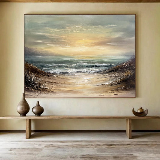
How to Choose Ocean Artwork for Coastal and Inland Rooms
Ocean paintings fail for two opposite reasons. They look like a vacation postcard, or they look like a blue rectangle with no water in it. The useful middle is a canvas that holds horizon, weather, and color temperature—without forcing a lighthouse into every corner.
Start with BigArtify’s Ocean Artwork only after you know the wall, the light, and whether you want a readable seascape or an abstract field that merely behaves like water.
What museums mean by “the sea on a canvas”
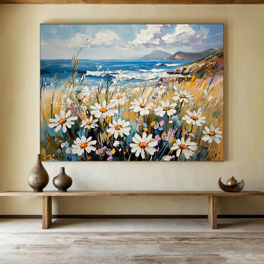
Painters have treated the ocean as a subject for centuries. Wikipedia’s entry on marine art distinguishes pictures that include ships and human seafaring from pure seascapes with little or no figure. A seascape, in the older sense, is simply a work whose main image is the sea. You do not need a Dutch man-of-war on the wall. You do need to decide which tradition you are borrowing: narrative coast, open water, or color and motion with no shoreline at all.
The National Gallery of Art groups historic and modern examples under Seascapes, and the wall text is blunt: artists return to the sea for calm and for the way light hits unsettled water. That is still the buying problem. A glassy turquoise band can rest a bedroom. A storm of white impasto can energize a hallway and exhaust a place meant for sleep.
Abstract ocean versus literal beach
Literal seascapes show horizon, foam, wet sand, sometimes a pier. They work in rooms that already accept “coastal” furniture—white oak, linen, rope, pale walls. They fight rooms full of pattern, brass, and heavy traditional molding.
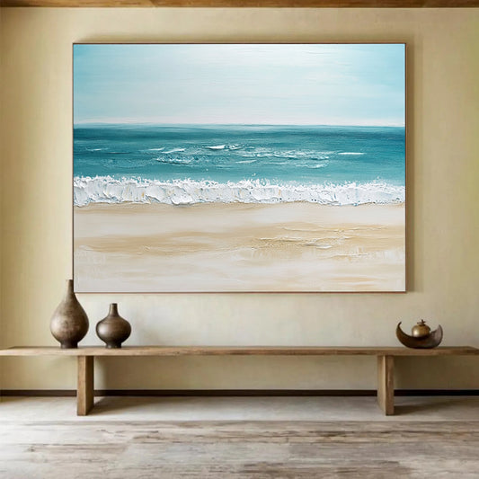
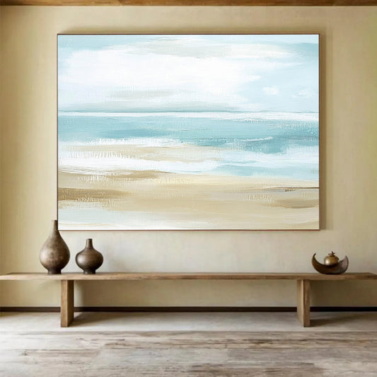
Abstract ocean paintings keep the temperature and rhythm of water: horizontal bands, pulled blues, knife-cut whites, a darker undertow. They are easier in inland apartments because they do not announce “we decorated a beach house.” They also scale up more cleanly. A six-foot horizon line is architecture. A six-foot postcard wave is a poster.
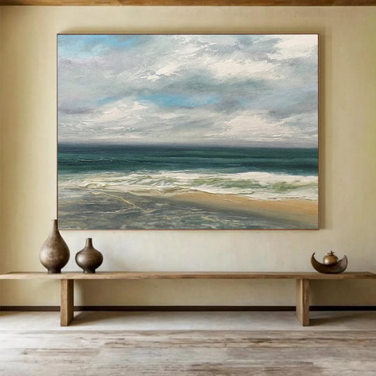
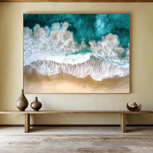
Impasto and textured coasts sit between the two. Thick whites read as spray; ridges catch side light. These pieces need a window or a lamp from the side. Overhead-only lighting flattens the water back into a print.
Photography prints of real beaches belong in a different decision. If the collection includes both photos and painted canvases, do not mix them on one wall unless the palette is tightly controlled. A sharp photograph next to loose oil usually makes the painting look unfinished and the photo look cheap.
Color: the ocean is not one blue
Most disappointing ocean canvases use a single tube of “ocean blue.” Real water shifts.
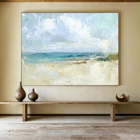
- Cool coastal: teal, slate, chalk, silver. Good with gray walls and nickel hardware. Can feel cold on a north-facing wall.
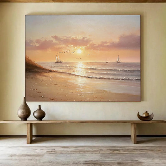
- Warm coastal: sand, champagne, soft gold, pale peach over blue-gray. Easier next to oak and cream sofas.
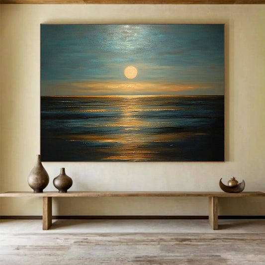
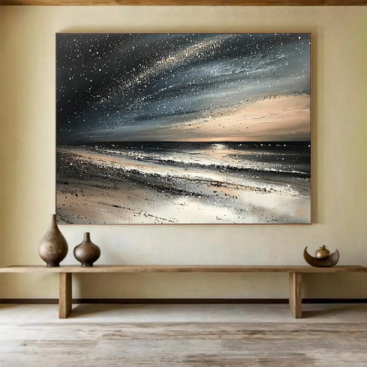
- Storm palette: indigo, black-green, dirty white. Strong in dining rooms and offices; heavy in small bedrooms.
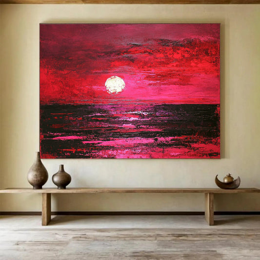
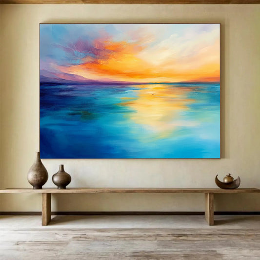
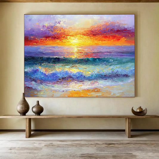
- Sunset ocean: coral, rust, violet. Use as an accent painting, not as the only large field in a colorful room.
Look at the value range—the gap between the lightest foam and the darkest trough. If everything sits in mid-blue, the piece will die at sofa distance.
Size and format for water
Horizontals suit the subject. The eye already expects a horizon.
Above a sofa. Aim for about two-thirds of the sofa width. A long, low seascape often beats a tall splash of wave, which can feel like a window placed too high.
Hallway or stair. A vertical “plunge” of water can work if the movement runs up the wall with you. A wide horizon in a narrow corridor gets cropped by doorways.
Bedroom. Prefer calmer fields and a horizon that sits in the middle third of the canvas, not a crashing foreground.
Dining room. Slightly more weather is acceptable. People sit and look; they can handle broken whites and darker water.
Custom size matters because horizons punish wrong proportions. Stretching a square wave study into a 2:1 panorama smears the break. If the wall is 90 inches, order width to that wall and keep the composition’s original logic.
Where ocean art goes wrong in real houses
Hanging a turquoise painting against a turquoise wall erases the water. Give the canvas a quieter ground—warm white, greige, pale sand.
Matching the painting to every throw pillow (“all the blues in the room”) makes the wall look merchandised. Pick two colors from the canvas, not six.
Going too small is the other failure. Ocean subjects need air. A 24-inch seascape over a long sofa looks like a postcard taped to a billboard.
Shipping rolled is common for large canvas. Confirm stretching and whether the paint is dry enough that thick whites will not scuff in the tube.
A short checklist
- Abstract field, readable coast, or photo—choose one language for that wall.
- Palette named in three colors, not “beach.”
- Width set by furniture or wall, format set by horizon.
- Lighting checked for texture.
- Contrast visible from across the room.
- Stretching and depth confirmed on oversized orders.
Ocean paintings earn their keep when they change with the day: cooler in morning light, warmer at dusk, readable as water without a caption. Measure first, then pick weather.
What size ocean painting works above a sofa?
Use about two-thirds of the sofa width, usually a horizontal canvas. Leave 6–10 inches between the top of the cushions and the bottom of the painting so the horizon does not sit on people’s shoulders.
Is abstract ocean art better than a realistic seascape?
For most inland living rooms, yes. Abstract bands and textured blues read as water without locking the room into nautical décor. Choose a realistic coast if the house is already coastal and you want a recognizable shore.
Which colors feel calm in a bedroom?
Muted slate, sand, chalk, and a restrained teal. Avoid high-chroma turquoise blocks and storm-black troughs. The horizon should be quiet, not a crashing foreground.
Do textured or impasto ocean paintings need special lighting?
They need some raking light—window or a picture light from the side. Flat ceiling spots will hide the ridges that stand in for foam. Ask for a close photo of the surface before you order.
Can I hang ocean artwork in a room with no view of the water?
Yes. That is most of the market. Keep the painting abstract or lightly suggestive so it does not look like a souvenir. Limit seashells and anchor décor on the same wall.
Should an ocean canvas be framed?
A floating frame in oak, white, or thin black finishes most interiors. Heavy gold nautical frames fight contemporary rooms. Oversized pieces that ship rolled will need stretching before any frame is chosen.