How to Choose a Green Abstract Painting
Green is the color most rooms already borrow from plants, and the color that most often looks like a spa poster once it hits canvas. Sage can calm a warm wood room. Emerald can look like bottled mint. Olive can sit with walnut. Lime can date a wall in a year.
Shop BigArtify’s Green Abstract Painting after you name the green you mean—and after you look at the actual leaves and wood in the room, not at a filter called “verdant.”
What painters used when they needed green
Studio greens are a family, not a mood board. Green earth (terre verte) is a mineral pigment, olive to grey-green, used since Roman wall painting and later as an underlayer for flesh. It is quiet on purpose. Viridian is a nineteenth-century blue-green, darker and more saturated—the kind of green that still looks like paint rather than grass. Wikipedia’s overview of green pigments is useful for shoppers: malachite, terre verte, viridian, and modern phthalo greens are not interchangeable. Phthalo in particular is intense; a little goes a long way on a sofa wall.
You do not need those labels on the stretcher. You do need to pick a lean:
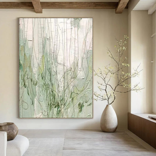
- Sage / grey-green. Soft, a little ashy. Fits oak, linen, plaster.
- Olive. Yellow-brown in the mix. Fits walnut, brass, cream.
- Viridian / teal-green. Blue in the mix. Fits nickel, white oak, cool walls.
- Forest / ink-green. Near-black. Needs chalk or sand so it does not become a hedge.
- High-chroma emerald or lime. Only if the room is plain and you want the painting to be the loudest object.
If the thumbnail looks like a rain-forest smoothie, keep scrolling.
Green plus the greens you already own
Count living plants and painted walls before you buy.
A fiddle-leaf fig plus an emerald canvas plus sage throw pillows is three competing greens. Let one lead. If the plants are the display, choose olive or sage that sits under the leaves, not a second tropical.
Green walls are the other trap. Mid-sage paint plus mid-sage painting erases the art. Give the canvas a lighter or cooler ground—warm white, pale sand, or a slightly greyer green than the wall.
Wood temperature matters. Honey oak next to blue-green viridian can look orange. Walnut next to lime looks costume. Match undertone: yellow-greens with warm wood, blue-greens with cool floors and nickel.
Contrast and light
Green paintings fail in the middle. Mid-sage on greige in a north room is a stain.
You need a light the doorway can still see: chalk, fog, or warm sand against olive or forest. Texture helps when there is sidelight; knife ridges in pale green-grey keep the field from going flat. Overhead cans alone turn impasto moss into a print.
North light pulls grey out of sage and can kill yellow-olive. You may need clearer darks, not more “fresh” green. West light warms olive toward khaki; if that bothers you, lean slightly bluer.
Gold leaf on green is easy to overdo. A thin warm line on forest green can work with brass. Speckles of gold on mint usually look like holiday décor.
Rooms
Living room. Sage or olive fields next to wood and wool. Keep other art on that wall quieter.
Bedroom. Grey-green and soft olive. High-chroma emerald behind a bed can feel like a wellness ad.
Dining room. Olive and forest sit well with food and tables. Avoid lime.
Office. Sage geometry or a quiet viridian field. A jungle-bright abstract behind your head reads as branding.
Do not default to green because the room is a “calm space.” Calm comes from value and fewer hues, not from the word nature.
Size
Green does not contrast as hard as black-and-white, so undersizing is common. Use about two-thirds of the sofa width, 60–75 percent of an open wall, and 6–10 inches above the cushions. On a high ceiling, add height; a short mint slab under a two-story void looks like packaging.
Custom size is worth it for odd niches. Keep the undertone when you recolor. Sage to olive is a family shift; sage to teal-and-pink confetti is a different work.
Checklist
- Green named: sage, olive, viridian, forest, or high-chroma.
- Plants and wall paint counted so greens do not stack.
- Undertone matched to wood and metal.
- Light and dark visible from the doorway.
- Gold used as a line, if at all.
- Width set by furniture, not by “verdant.”
A green abstract painting earns its keep when it behaves like climate—earth, shade, still air—not like a stand-in for a houseplant.
How do I tell sage from olive from emerald?
Sage has grey in it and sits quiet next to plaster. Olive has yellow or brown and sits next to walnut. Emerald is saturated and cool-bright; it will be the loudest object on the wall. If you cannot name the lean, the painting will fight the furniture.
Will a green painting clash with my plants?
It will if both are the same high chroma. Choose a duller, greyer, or browner green than the leaves, or let the canvas be forest-dark so the plants stay the bright note. Matching “botanical green” to a fiddle-leaf is how rooms look themed.
Can I hang a green abstract on a green wall?
Only with a value or temperature gap. Pale sage art on dark forest paint can work. Mid on mid disappears. Warm white or sand around the canvas is the safer default.
Is green abstract art only for spa and wellness rooms?
No. Olive and ink-green fields belong in dining rooms and studies. The spa look comes from mint, gold specks, and the word “tranquil” in the product title. Skip those three and green is just another neutral-with-a-bias.
Does viridian or teal-green work with oak floors?
Sometimes, if the oak is cool or greyed. Yellow oak plus blue-green often makes the floor look orange. Test a swatch. Olive or sage is the safer pair with honey wood.
What size green canvas works above a sofa?
About two-thirds of the sofa width. Because green is mid-energy, do not go tiny “to keep it calm.” Too small looks unfinished; too saturated looks loud. Get the lean right, then size to the furniture.