
The Luxury Pairing: How Navy Blue and Gold Abstract Paintings Transform Modern Living Rooms
Few color combinations convey quiet luxury as effectively as navy blue and gold. In modern living rooms, this pairing creates depth, warmth, and a sense of refined drama without relying on excess ornament. When the combination appears in abstract painting—especially large-scale works with textured surfaces or metallic leaf—the effect becomes even more powerful. A single well-chosen canvas can anchor an entire seating area, elevate neutral furniture, and give a contemporary space the polished presence once associated with classic interiors.
Navy blue carries associations of calm authority and expansive depth, while gold introduces light, warmth, and a subtle sense of celebration. Together they balance cool and warm temperatures, making the living room feel both grounded and luminous. Designers consistently return to this pairing because it adapts easily to different architectural styles: it works in minimalist lofts, transitional family rooms, and more formal open-plan spaces.
Why Navy and Gold Work So Well Together
Color theory explains part of the appeal. Deep navy sits near the cooler end of the spectrum and can absorb light, creating intimacy. Warm gold (or brass and antique finishes) reflects light and pulls amber undertones from the blue, preventing the room from feeling cold or closed-in. The result is a natural visual tension that feels intentional rather than accidental.
In practice, the combination follows a classic 60-30-10 approach. Neutrals—cream, warm white, soft beige, or light wood—often occupy the majority of the room. Navy appears in larger furniture or the artwork itself. Gold is reserved for accents: frames, lighting, hardware, and the metallic passages within the painting. This restraint keeps the look sophisticated rather than theatrical.
Abstract painting is particularly suited to the pairing. Because abstract work does not depict literal objects, the colors themselves become the primary subject. Fluid brushwork, palette-knife texture, or gold-leaf highlights can suggest movement, depth, or quiet energy without competing with the architecture of the room.
Choosing the Right Scale and Placement
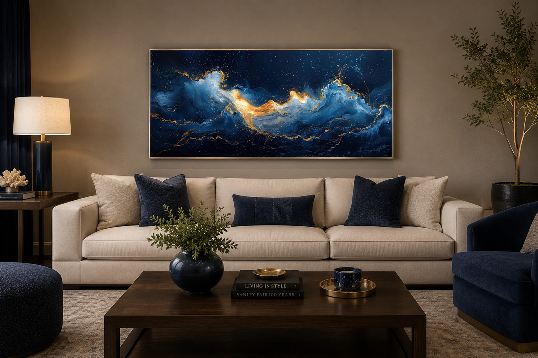
Scale is critical. A small print rarely carries the weight needed to transform a living room. Designers generally recommend that a painting above a sofa span roughly two-thirds the width of the furniture. For most modern sofas this means a horizontal canvas of at least 48 to 60 inches, and often larger. Oversized works feel confident and architectural; undersized ones tend to look tentative.
Ideal placement is usually centered above the main seating arrangement, with the center of the artwork at approximately eye level (around 57–60 inches from the floor). Leaving breathing room between the top of the sofa and the bottom of the frame—typically 6 to 10 inches—prevents the composition from feeling cramped. In rooms with high ceilings, a taller or multi-panel arrangement can help fill vertical space without overwhelming the furniture.
Lighting matters as much as size. Warm-toned accent lighting or wall washers bring out gold leaf and metallic accents after dark, while natural daylight reveals the full range of blue tones during the day. Avoid harsh overhead spots that create glare on glossy surfaces.
Styling the Living Room Around the Artwork
Once the painting is in place, the surrounding elements should support rather than compete with it. A cream or light-taupe sofa provides clean contrast and allows the navy to dominate. Soft textiles in complementary blues, charcoal, or muted gold add layered texture without introducing new colors. Brass or antique-gold table lamps, a simple metal-framed coffee table, and a few sculptural objects in warm metal complete the conversation between the wall and the floor.
Natural materials further enhance the pairing. Light oak or walnut flooring, a linen or wool rug in neutral tones, and ceramic or stone accessories prevent the scheme from feeling overly polished. The goal is balance: the painting supplies drama, while the rest of the room supplies calm.
Many contemporary Blue Abstract paintings incorporate gold leaf, metallic pigment, or warm ochre accents that make this coordination almost effortless. Textured surfaces catch light differently throughout the day, giving the living room a subtle sense of movement even when the space is still.
Variations Within the Palette
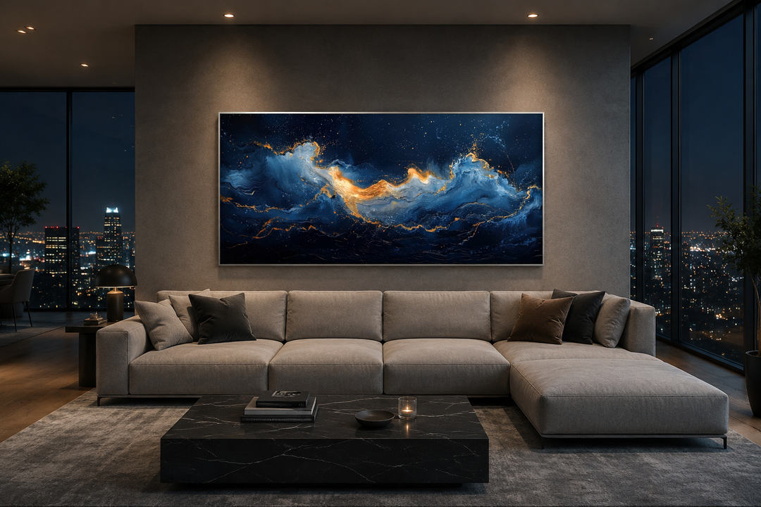
Not every navy-and-gold painting looks the same. Some lean toward deep indigo with fine gold veining. Others use broader sweeps of metallic leaf against a darker ground. Still others introduce soft white or pale blue passages that lighten the overall effect. Choosing among these options depends on the existing palette of the room and the amount of natural light available.
In brighter spaces with large windows, a darker navy canvas can provide welcome visual weight. In rooms that receive less daylight, a composition that includes more white or mid-tone blue prevents the wall from absorbing too much light. Gold finishes also vary: warm antique gold or brushed brass tends to harmonize more easily with residential interiors than bright, highly polished yellow gold.
The versatility of abstract work is another advantage. Because the imagery is non-representational, the same painting can shift character when the surrounding textiles or lighting change. Seasonal pillow covers or a different rug can refresh the room without requiring a new artwork.
Practical Considerations for Modern Homes
Large abstract paintings require careful handling and installation. Professional hanging hardware rated for the weight of the stretched canvas is essential, especially for pieces over 40 inches in either direction. In homes with children or high traffic, placing the work slightly higher or choosing a more durable surface finish reduces risk.
Maintenance is generally straightforward. Dust with a soft, dry cloth and avoid direct sunlight for prolonged periods if the painting includes delicate gold leaf. Most contemporary acrylic or mixed-media works on gallery-wrapped canvas are designed for residential environments and hold their color well under normal conditions.
When selecting a piece, consider the emotional tone you want the living room to carry. Navy and gold can feel formal and collected, or they can feel relaxed and contemporary, depending on the brushwork and the surrounding furnishings. A heavily textured, gestural painting introduces energy; a more restrained composition with clean passages of color feels quieter and more architectural.
The Lasting Appeal of the Combination
The pairing of navy blue and gold has appeared in interiors for centuries, from historic European rooms to mid-century modern apartments and today’s open-plan living spaces. Its endurance stems from the fundamental contrast between cool depth and warm luminosity. Abstract painting simply updates the language, allowing the colors to speak without narrative distraction.
In a modern living room, a well-chosen navy-and-gold abstract work does more than decorate a wall. It establishes a focal point, sets the chromatic temperature of the space, and quietly signals that the room has been considered with care. Whether the rest of the furnishings are minimal or richly layered, the painting provides a stable center around which everything else can settle.
For those seeking original, large-scale options, collections of Blue Abstract paintings offer a wide range of approaches—from subtle gold accents to more dramatic metallic passages—making it possible to find a piece that fits both the architecture and the atmosphere of the room.
Frequently Asked Questions (FAQ)
Q: What size navy-and-gold abstract painting works best above a sofa? A: Aim for a horizontal piece that spans roughly two-thirds the width of the sofa. Most living rooms benefit from works 48 inches or wider; larger walls can support 60 inches and beyond.
Q: Can navy and gold abstract art work in a small living room? A: Yes. Choose a single strong piece rather than multiple small ones, keep surrounding walls light, and use gold accents sparingly in lighting and accessories so the room does not feel crowded.
Q: What wall colors pair best with navy blue and gold paintings? A: Warm whites, soft creams, light greige, and pale warm grays provide the cleanest contrast. Very cool gray or stark white can make the navy feel colder.
Q: How should I light a painting that includes gold leaf? A: Use warm-toned accent lighting or wall washers that graze the surface. Avoid direct, high-intensity spots that create glare on the metallic areas.
Q: Is gold leaf durable in a residential setting? A: When properly sealed, contemporary gold leaf or metallic finishes on abstract canvases are suitable for living rooms. Avoid prolonged direct sunlight and clean gently with a dry cloth.
Q: Should the painting match the exact shade of navy in my furniture? A: Exact matching is unnecessary and often less successful. Slight variations in tone create depth. Focus instead on overall temperature—cool or warm—and the balance of light and dark.
Q: Can I mix navy-and-gold abstract art with other metals? A: Yes, but keep gold or brass as the dominant metallic. Small amounts of blackened steel or soft silver can work if they remain secondary.
Q: Where else in the home can this color pairing succeed? A: The same navy-and-gold abstract works well in dining rooms, studies, and formal entryways, provided scale and lighting are adjusted to the specific space.
A thoughtfully chosen navy blue and gold abstract painting remains one of the most reliable ways to bring lasting sophistication into a modern living room. When scale, placement, and supporting elements are considered together, the result feels both luxurious and livable—an enduring combination that continues to reward attention over time.