How to Choose a Blue And Grey Painting for Calm, Modern Walls
Blue and grey is not a safe default. It is a climate. Done well, the pairing cools a warm wood room and gives a sofa wall a horizon without a seascape. Done badly, it is a single mid-tone smear that dies at six feet—the “hotel abstract” problem.
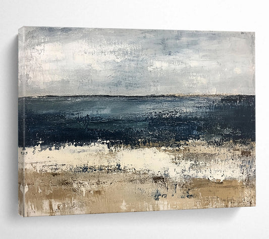
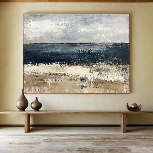
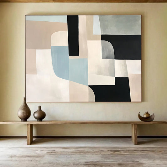
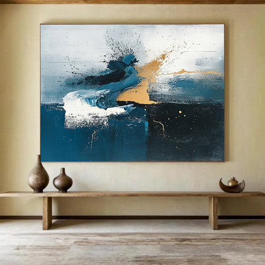
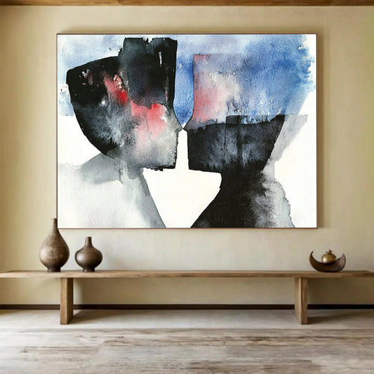
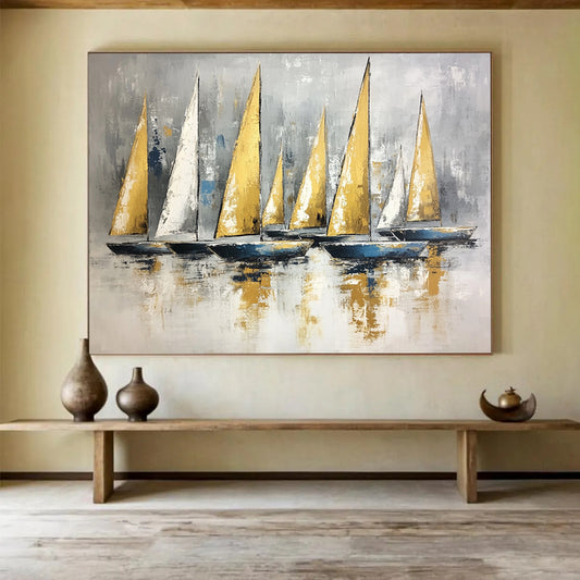
Shop BigArtify’s Blue And Grey Painting after you know the wall’s light and the warmth of the furniture. The palette is narrow on purpose. The painting still has to do work.
Why this pairing keeps showing up in serious painting
Limited palettes are an old studio habit. Tate’s definition of monochrome is one color used through its tones; painters have long used greys—and close neighbors of grey—to model light rather than to decorate. Blue, pushed through slate, ink, and chalk, behaves the same way: the picture becomes value and temperature instead of a pile of hues.
Picasso’s Blue Period is the famous case of blue used almost alone, sometimes warmed only slightly, to hold a mood across a whole surface. You are not buying that subject matter. You are borrowing the discipline: few colors, many steps between dark and light.
Grey has another job. In twentieth-century painting it often reads as neutral ground—the place where color is neither celebrating nor shouting. The Metropolitan Museum’s Richter guide notes how fields of grey can make “everything equally important and equally unimportant,” a useful warning for interiors: grey is not empty, but it will not rescue a composition that has no structure. Read that discussion of his Gray Pictures if you want museum language for why a grey plane still needs a decision.
Cool blue, warm grey: name the temperature
“Blue and grey” hides several climates.
- Steel / slate: blue-grey with little green. Fits nickel, concrete, cool white walls.
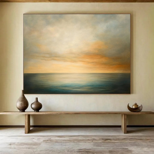
- Coastal teal-grey: a hint of green in the blue. Fits linen, oak, pale plaster.
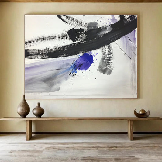
- Ink and chalk: near-black blue against off-white grey. High contrast; architectural.
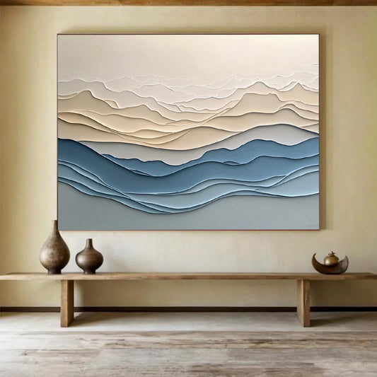
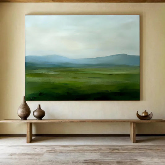
- Fog: many close mid-tones, low contrast. Calm in bedrooms; invisible on a dim wall.
Hold a fabric swatch or a phone photo of the sofa next to the painting. If the sofa is camel or walnut, a slightly warm grey (towards taupe or putty) will sit; an icy blue-grey can make the wood look orange. If the room is already cool—white oak, grey floor, chrome—you can go colder.
Gold or beige inside a blue-grey field is a common studio accent. Use it when the room lacks warmth. Skip it when the space already has brass, honey oak, and a cream rug, or the wall will look gilded.
Contrast is the real size of the painting
Two canvases can share a palette and behave differently across a room.
High contrast—deep indigo against pale grey—reads from the doorway. Low contrast fog needs closer viewing and stronger daylight. North-facing rooms often need a clearer dark and a clearer light, or the painting becomes a stain.
Look at a photograph of the whole canvas from across a room, not only a color crop. If the lightest and darkest marks collapse into one mid-blue-grey, the piece will not hold a sofa wall.
Texture helps this palette more than most. Palette-knife ridges in white-grey catch sidelight and keep a quiet painting from going dead. Flat overhead spots erase that. If you only have ceiling cans, either add a picture light or choose a composition with stronger value steps, not only thicker paint.
Where blue-grey belongs
Living room. The default home for a large horizontal field. Keep other art on that wall quieter so the climate stays one climate.
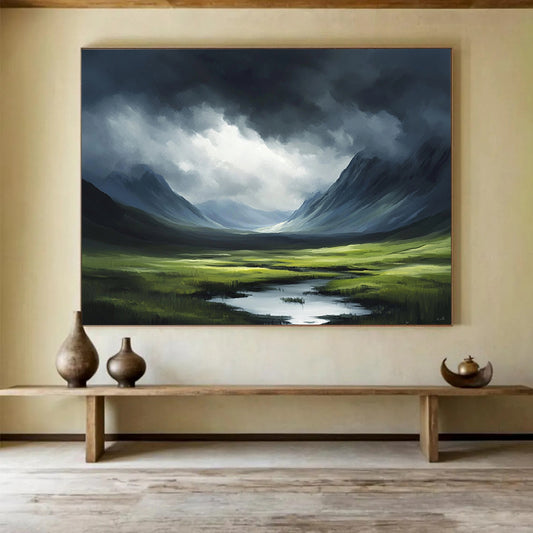
Bedroom. Fog and mid-value fields work if the contrast is gentle. Storm-dark indigo behind a bed can feel heavy.
Bathroom and hallway. Moisture and traffic argue for a simpler surface and a frame. Color still works; high relief collects vapor and dust.
Office. Slate fields sit well on camera. Avoid a hot turquoise block behind your head.
Do not paint the wall the same mid-blue-grey as the canvas. The painting needs a quieter ground—warm white, greige, or pale sand—so the blues can separate.
Size and format
Use the same architecture rules as other large abstracts: about two-thirds of the sofa width, 60–75 percent of an open wall, a margin of plaster around the canvas. Horizontals suit this palette because they behave like weather or water. A tall, narrow blue-grey slab can work on a stair if the darks run with the rise.
Custom size is worth it when the niche is an odd width. Keep the value structure when you recolor: swapping steel for teal is safe; turning a two-value painting into six accents is a different work.
Checklist
- Temperature named: steel, coastal, ink-and-chalk, or fog.
- Contrast checked from across the room.
- Furniture warmth compared to the greys.
- Accents (gold, beige, black) limited to one.
- Lighting checked if the surface is built.
- Width set by the wall, not by the word “blue.”
A good blue-and-grey painting is a controlled climate. If you can still see a dark, a light, and a direction from the doorway, the palette is doing its job.
Will a blue and grey painting make a room feel cold?
It can, next to cool floors and white walls. Warm the scheme with oak, wool, camel, or a slightly putty grey inside the painting. Icy blue-grey plus chrome plus grey tile is what feels clinical.
Is this palette only for coastal rooms?
No. Inland modern rooms use it as a substitute for a view: a field of weather rather than a postcard beach. Keep seashell décor off the same wall if you do not want the painting to read as “theme.”
How much contrast should I look for?
Enough that the lightest grey and the darkest blue still separate from the sofa. Fog palettes need good daylight. Dim rooms need clearer darks, not more texture alone.
Can I add gold leaf to a blue and grey canvas?
Yes if the room is otherwise matte and cool. No if brass, honey wood, and cream textiles already warm the space. One thin metallic band is usually stronger than scattered gold specks.
What size works above a sofa?
About two-thirds of the sofa width, usually a horizontal. Leave 6–10 inches above the cushions so the field sits as a horizon, not as a headboard extension.
Print or hand-painted canvas for this palette?
Hand-painted canvas holds the small shifts between slate and chalk that a flat print averages out. Those shifts are the whole point of a two-color painting. Ask for a detail photo in natural light before you order.