How to Choose Colorful Paintings Without Overwhelming the Room
Color is easy to want and hard to live with. A canvas that looks joyful in a grid can take over a sofa wall. A “vibrant” thumbnail often hides the only question that matters: after three months, will you still want those hues in the same room as your furniture?
Look through BigArtify’s Colorful Paintings after you have named the room’s existing temperatures—wood, metal, wall paint—and decided whether the painting should be the loudest object or one climate among others.
What intense color is for
Painters have long treated color as the subject, not the garnish. Wikipedia’s note on colourist painting is blunt: hue becomes more important than the other qualities of the picture. Fauvism made that attitude public—unnatural, high-key color used on purpose, not because the artist could not mix a quieter grey.
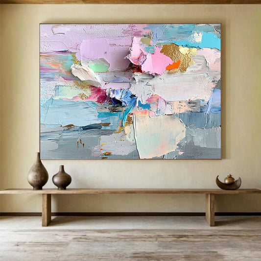
A different modern habit is color field painting: large, relatively even areas of color that behave like weather rather than like a bouquet. That split is a buying filter. Scattered dabs of six primaries are not the same object as two or three big climates of color.
You do not need a museum label. You do need to pick a structure:
- Field: broad planes, few hues, the wall becomes a temperature.
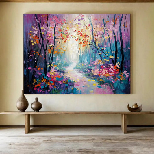
- Gesture: many marks, color rides on speed and collision.
- Prism: high-chroma pieces that keep several families visible at once.
Most living rooms can take a field. Fewer can take a prism.
Limit the cast, not the saturation
“Colorful” fails when every tube gets a speaking part.
Name three colors you can live with, then let the rest be support. A painting of coral, slate, and chalk can be vivid. A painting of coral, teal, lemon, violet, kelly, and gold is a catalog page.
Useful combinations:
- Warm spectrum: rust, ochre, ink, warm white
- Cool spectrum: teal, slate, violet, chalk
- Dual climate: one warm family and one cool family, with a neutral to separate them
Dangerous defaults:
- Equal amounts of six primaries
- Rainbow plus gold leaf plus heavy impasto
- Matching every throw pillow so the wall looks merchandised
Saturation is not the enemy. Equality is. One or two high-chroma notes against quieter neighbors will read as color. Six notes at the same volume will read as noise.
Test against the actual room
Hold the painting’s temperature next to the sofa, not next to other paintings.
Warm wood and camel upholstery can take rust and ochre; icy neon on that furniture looks like a sticker. Grey floors and nickel can take teal and violet; a full sunset palette can make the architecture look dirty.
North light cools everything. A painting that already sits in cool blues may go dead; you may need a warmer note or clearer contrast. South and west light raise saturation. What looked playful at noon can feel hot at 6 p.m.
Look at a whole-canvas photo from across a room. If the piece collapses into a general “bright,” the structure is too weak for a large wall.
Size and surface
Color reads larger than a quiet grey of the same dimensions. Do not automatically upsize because the thumbnail felt fun.
Use the usual architecture rules: about two-thirds of the sofa width, 60–75 percent of an open wall, plaster around the canvas. Leave 6–10 inches above sofa cushions. On a high ceiling, height is a separate decision; a short rainbow slab under a two-story void looks like packaging.
Texture multiplies color. Knife ridges catch light and make hues flicker. That helps a limited palette. It makes a six-color prism harder. If the room is already patterned, keep the surface calmer.
Custom size is worth it for odd niches. Do not stretch a square burst of marks into a panorama unless the color masses were designed that way—the “extra” width often becomes leftover confetti.
Rooms
Living room. One large field with a limited cast. Avoid a second loud artwork on the same wall.
Bedroom. Lower contrast and fewer hot spots. Soft pinks and slates rest; equal blocks of red and yellow rarely do.
Dining room. More energy is acceptable; people sit and look. Still cap the number of families.
Hallway. Walking views want broader planes, not a puzzle of tiny brights.
Do not hang a high-chroma canvas on a wall painted a competing mid-color. Give it warm white, pale sand, or a quiet greige so the painting can separate.
Checklist
- Structure chosen: field, gesture, or prism.
- Three-color cast named.
- Temperature checked against wood and metal.
- Contrast readable from the doorway.
- Size set by furniture, not by enthusiasm.
- Texture matched to how busy the room already is.
Colorful paintings earn their keep when the hues still have ranks after the novelty fades: a lead, a support, and somewhere for the eye to rest.
How many colors should a colorful painting have?
As many as you can rank. Two or three families with a neutral is usually stronger on a sofa wall than six equals. Extra hues can exist as small notes, not as co-stars.
Will a colorful painting make a small room feel chaotic?
It can, if contrast is high and the wall is already busy. A limited field on a quiet ground often livens a small room. A prism plus patterned rug plus gallery frames will not.
Are colorful paintings only for modern interiors?
No. Warm, earth-based color sits in traditional rooms. Neon geometry belongs with simpler furniture. Match temperature and structure to the architecture, not to the word “colorful.”
Should I match the painting to my pillows?
Match climate, not every thread. Pull one or two tones into textiles if you want cohesion. Copying the whole spectrum onto throws makes the wall look like a shop display.
What size works above a sofa?
About two-thirds of the sofa width. Because bright color reads large, resist sizing up “for impact” unless the wall is high and empty.
Print or hand-painted canvas?
On a large wall, hand-painted canvas keeps edges and overlays that stop color from looking like a flat poster. Ask for a detail in daylight; screens oversaturate almost every thumbnail.