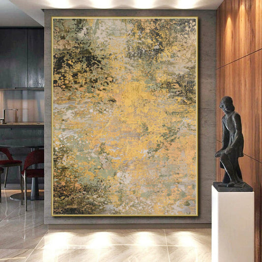
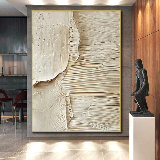
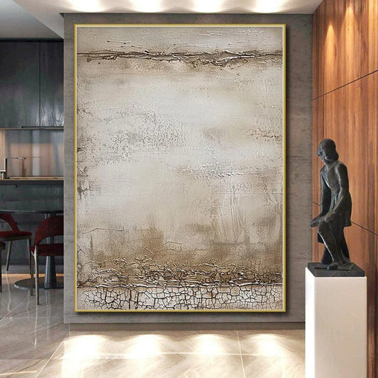
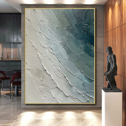
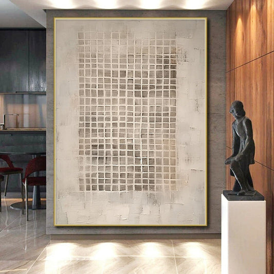
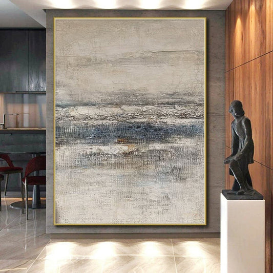
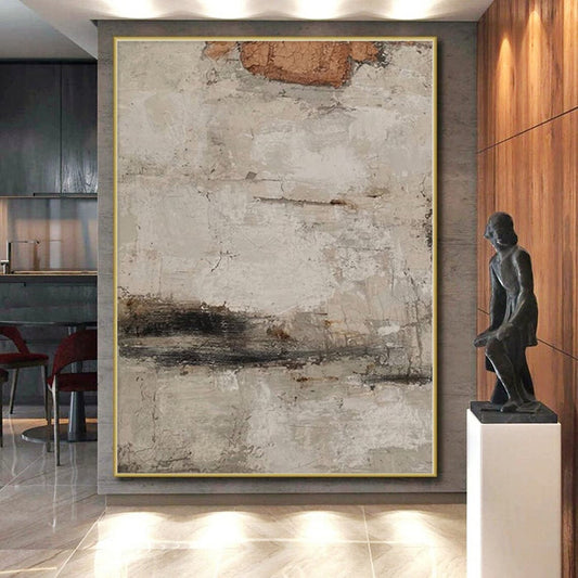
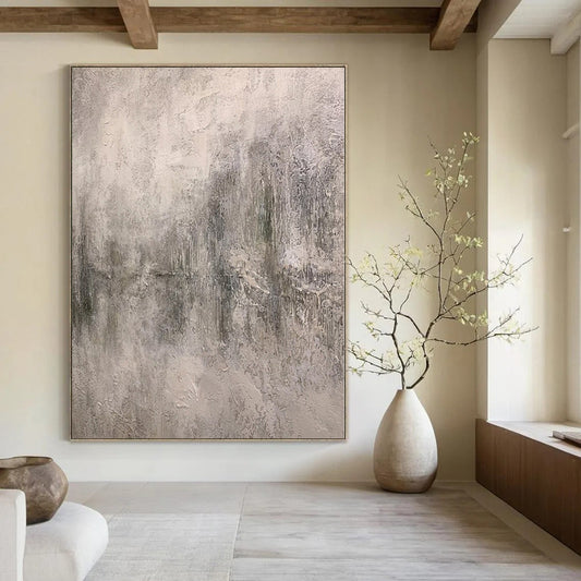
How to Choose Gray Abstract Wall Art
Gray is not the absence of a decision. It is a climate that either steadies a room or disappears into the plaster. A strong gray canvas holds a sofa wall the way good architecture holds light: through value, temperature, and a little surface. A weak one is a mid-tone smear that looks finished only on a phone.
Start with BigArtify’s Gray Abstract Wall Art after you know whether your walls are warm white or blue-white, and whether the furniture is oak, walnut, nickel, or black.
What gray has been asked to do in painting
Painting in greys is older than “minimal interiors.” Grisaille is work executed in black, gray, and nearby neutrals—sometimes as a finished picture, sometimes as a way to model light before color arrives. The point was never boredom. It was control of tone.
Tate’s glossary on monochrome is useful for shoppers: one color, many shades; gray oil used to define form through light and dark. In the twentieth century the same discipline moved into abstraction. Wikipedia’s overview of monochrome painting tracks how reduced palettes became a modern subject in themselves, including fields of gray that refuse both decoration and narrative.
You do not need a museum gray. You do need the same test: if you took the color names away, would the painting still have a dark, a light, and a direction?
Warm gray, cool gray, graphite
“Gray abstract” hides several climates.
- Warm gray / greige: a little brown or putty. Sits next to oak, linen, cream plaster, brass.
- Cool gray / slate: a little blue. Sits next to nickel, concrete, white oak, cool walls.
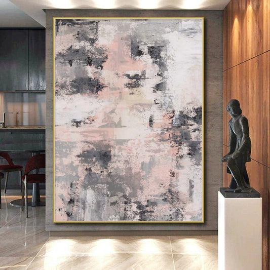
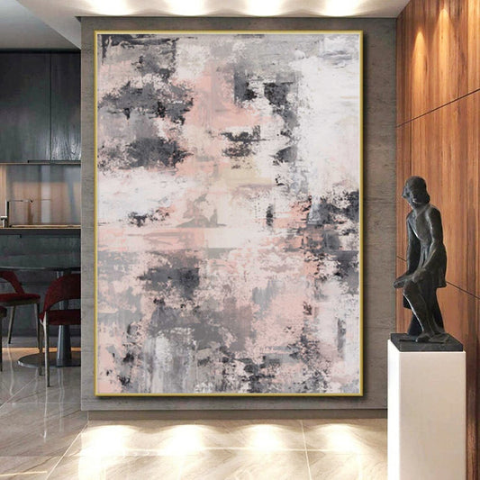
- Graphite and chalk: near-black against off-white. Architectural, high contrast.
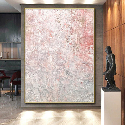
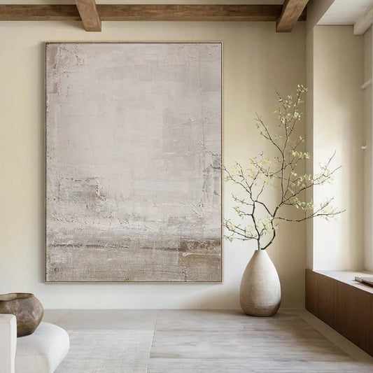
- Fog: many close mid-tones. Calm in a bright bedroom; invisible on a dim wall.
Hold a sofa photo or a floor sample next to the canvas. Warm wood next to icy slate makes the wood look orange and the painting look hospital. Cool floors next to greige can make the art look dirty. Match temperature first, contrast second.
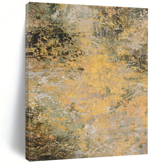
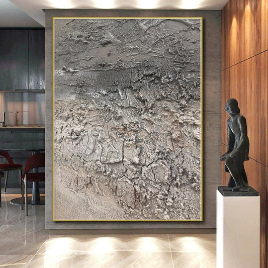
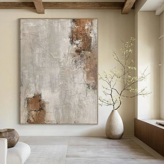
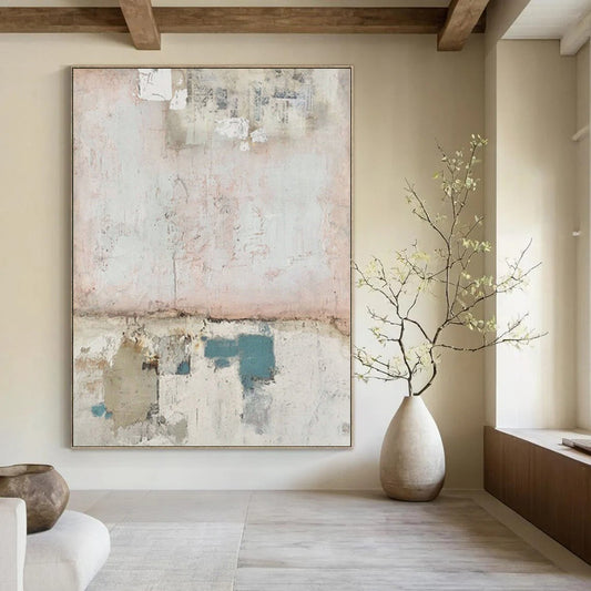
Small accents—one sand band, one ink mark, a thin warm white ridge—are usually enough. A gray painting that also wants gold leaf, teal, and rust is no longer a gray painting; it is a mixed palette wearing a gray title.
Contrast is the real scale
Two gray canvases of the same size can behave differently from the doorway.
High contrast (charcoal against chalk) reads across an open plan. Low-contrast fog needs daylight and closer viewing. North-facing rooms often need a clearer dark and a clearer light, or the work becomes a stain on the wall.
Texture helps this palette more than most. Palette-knife ridges in pale gray catch sidelight and keep a quiet field from going dead. Flat ceiling spots erase that. If overhead cans are the only light, buy stronger value steps, not only thicker paint—or add a shallow picture light.
Look at a whole-canvas photo from across a room, not a beauty crop of a single swirl. If the lightest and darkest marks collapse into one mid-gray, the piece will not hold a sofa.
Rooms
Living room. The default home for a large horizontal field. Keep other art on that wall quieter so one climate stays one climate.
Bedroom. Mid-value warm grays and soft texture. Storm-dark graphite behind a bed can feel heavy.
Office. Slate fields sit well on camera. Avoid a busy gray maze behind your head.
Hallway. Walking views want broader planes. Micro-texture that looks rich at 12 inches can read as noise at 10 feet—or as nothing.
Do not paint the wall the same mid-gray as the canvas. Give the work a quieter ground: warm white, pale sand, or a slightly different greige so the painting can separate.
Size and surface
Use the usual architecture rules: about two-thirds of the sofa width, 60–75 percent of an open wall, a margin of plaster around the canvas. Hang the visual center near 57–60 inches in standing rooms; over a sofa, leave 6–10 inches above the cushions.
Custom size is the practical reason to order rather than grab a standard rectangle. Keep the value structure when you resize. Stretching a square fog study into a 2:1 panorama smears the only thing the painting had.
Confirm unframed depth if the surface is built, and how oversized work ships. High peaks in a tube can flatten. A floating frame in oak, white, or thin black finishes most gray canvases; heavy gold fights the palette.
Checklist
- Temperature named: warm, cool, graphite, or fog.
- Contrast visible from the doorway.
- Furniture and floor compared to the gray.
- Accents limited to one.
- Lighting checked if the surface is built.
- Width set by the wall, not by the word “minimalist.”
Gray abstract wall art earns its keep when it still has structure after you stop noticing it is gray: a stable field of dark, light, and air that the room can use every day.
Will gray abstract art make a room feel cold?
Cool slate can. Warm gray or greige next to oak and wool usually will not. The cold feeling comes from icy gray plus chrome plus blue-white walls, not from gray as a family.
Is gray abstract the same as black and white art?
No. Black and white is high-contrast drawing in paint. Gray abstract lives in the middle values and small temperature shifts. Some pieces include both; do not assume a “gray” title means a charcoal sketch.
How much texture should a gray painting have?
Enough to catch the light you actually have. Soft ridges suit bedrooms and north rooms with a window. Heavy relief needs sidelight and a simpler room, or it becomes a second pattern.
What size gray canvas works above a sofa?
About two-thirds of the sofa width, usually a horizontal. Leave space above the cushions so the field reads as a plane, not as an extension of the upholstery.
Can I hang gray abstract art on a gray wall?
Only if the wall and the painting differ in value or temperature. Mid-gray on mid-gray erases the work. A warm white or pale sand wall is the safer ground.
Print or hand-painted canvas for gray work?
Hand-painted canvas keeps the small shifts between putty, slate, and chalk that a print averages into one ink. Those shifts are the subject. Ask for a detail photo in natural light before you order.