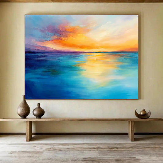
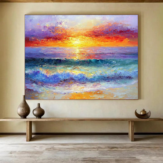
How to Choose Orange Abstract Art That Holds Dusk, Not a Warning Cone
Orange is yellow with the volume turned toward heat. On a phone it reads as sunset. On a wall it can go terracotta, rust-orange, apricot, or traffic-cone neon depending on the bulbs and the hour. Orange abstract art works when you can name that climate—clay, burnt sienna, a quieter dusk against gray—and the structure still reads from across the room. A flat tangerine fill labeled “energy” is a poster.
Orange Abstract Art in this collection means hand-painted canvas in that range: dusk fields, textured orange-gray planes, a seascape climate that has already dropped the sailboat catalog. The listing is a temperature. The piece you receive is painted to order in that temperature, not a printed sundown.
Orange as a complementary heat, not as a slogan
Wikipedia’s article on orange (colour) is the useful studio note: Impressionists learned that orange next to a cooler blue makes both colors louder. That is why a loud orange canvas on an already warm oak wall can feel twice as hot as the thumbnail. You do not need a color wheel at checkout. You need to know whether the listing has earth in the orange—or only candy.
Monet’s Impression, Sunrise is the public example: a small orange sun and its reflection inside a hazy, cooler field. The painting is not a cone of fire. The orange works because the rest of the climate stays quiet. A contemporary abstract should survive the same test. Take the words “burst of energy” off the product title. Does a structure remain—a band of dusk, a scraped clay plane, a split between warmer ground and cooler air?
Turner spent a career watching heat sit on water. Tate’s Sunset over the Sea is weather first: tone, horizon, a temperature moving sideways. You are not buying a Turner. You are borrowing the habit. Let orange be dusk and clay. Keep the souvenir pier and the cartoon sun off the stretcher.
A working split:
- Terracotta and rust-orange: earth in the mix. Sits with oak, walnut, linen.
- Apricot and clay: softer. Better when the window already supplies sunset.
- Burnt orange against gray: architectural. Safer in rooms that already have wood heat.
- Traffic-cone on optical white: the hazard version. Avoid it on a west wall.
Sunset pictures and orange abstracts are not automatically the same product. A labeled dusk with boats is a seascape. An orange field that only keeps temperature is closer to this brief. Choose by how much place the room can take.
How to match orange to wood, blue-gray, and afternoon light
Start with the light you cannot schedule away. A west window already throws gold-orange after 3 p.m. Another blazing field on that wall will stack heat until the painting looks louder than the furniture. A clay-gray dusk is often easier. North light cools orange toward rust-brown; that can rescue a listing that runs too clean. Warm bulbs pull apricot toward red. If the photo was shot in showroom white, check it against a daylight picture of your wall.
Oak and walnut sit with terracotta, rust, and orange that has umber in it. They fight neon tangerine and neon coral. Gray sofas can take burnt orange so the canvas does not vanish—or a quieter clay plane so the gray does not go icy. White rooms need a mid-to-deep orange; a pale peach wash disappears at noon and turns into glare under a downlight.
Blue in the room is not an accident. Orange next to slate, teal, or evening blue will vibrate. That can be the point on an empty wall. It is a problem if the sofa is already teal and the rug is already rust. Pick one heat source.
Sheen matters. Glossy tangerine reads as plastic. Matte or satin clay reads as plaster and late sun. Side light shows knife ridges. A spotlight on a pale orange peak turns dusk into a warning lamp. Dining rooms can take a stronger plane. Bedrooms and offices on camera usually need mid values and lower gloss.
Format follows the empty rectangle. Dusk usually wants width—a horizontal field so the heat can travel. Unused height can take a vertical rise. A small orange square in the middle of a wide sofa looks like a sticker. Measure the span. Deep impasto may need to ship stretched rather than rolled.
Handmade orange versus a printed “sunset” canvas
Printed orange is one digital fill. Hand-painted orange breaks: a darker rust trough, a scraped apricot, a gray-blue ground that keeps the heat from floating. Look for angled close shots, oil or acrylic on canvas, painted to order. Treat the thumbnail as temperature. Do not treat “orange” as a guarantee of energy you can live with in August.
Ask for more gray or umber in the orange if the floor is oak or the window faces west. Ask for less yellow if the listing runs neon. Approve photos of the finished surface before it ships. Custom stretch exists for the wall you measured.
A short buying order
- Name the orange: terracotta, rust, apricot, or dusk—not “vibrant.”
- Check whether the room already has west light or warm wood.
- Decide abstract field or sunset climate.
- Measure the empty span; pick a format that fits that box.
- Check sheen against lamps and any camera.
- Review photos of the finished canvas before it ships.
Orange abstract art that still works in six months is dusk under control. A cone is what you get when the only brief was “make it pop.”
How is orange abstract different from red or yellow art?
Yellow is higher and cooler-bright. Red is deeper and more wine-like. Orange sits between them: clay, rust, dusk. If the listing reads as scarlet, it belongs on a red wall. If it reads as lemon, it is yellow wearing a sunset title.
Will orange clash with a teal sofa?
It can, on purpose. Orange next to blue-green gets louder. If the room already has both heats, choose a clay-gray field with less chroma, or let one of the two colors win.
Is a sunset painting the same as orange abstract art?
No. A sunset still describes a time of day and often a horizon with boats. Orange abstract keeps temperature and structure. If you need the word “dusk” to finish the picture, you are buying a seascape.
What oranges sit with oak without looking loud?
Terracotta, rust, and burnt orange with gray or umber in them. Traffic-cone tangerine usually fights the wood, especially under afternoon sun.
Can orange abstract work in a dining room?
Yes, if the field is mid-to-deep and the sheen is quiet. Dining already has warm food light. A dirtier rust plane is easier to live with than a glossy apricot blaze.
Should I size orange art smaller because the color is strong?
Size to the empty span, then quiet the chroma if needed. A small screaming square on a long wall looks unfinished. A wider clay field is usually calmer than a tiny neon badge.