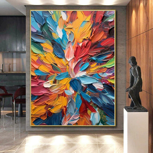
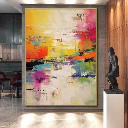
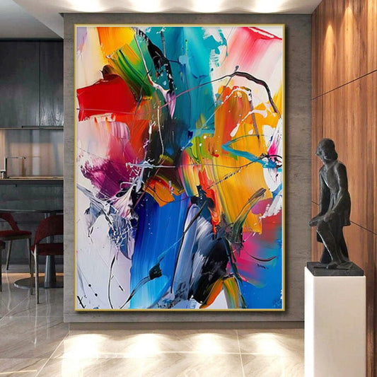
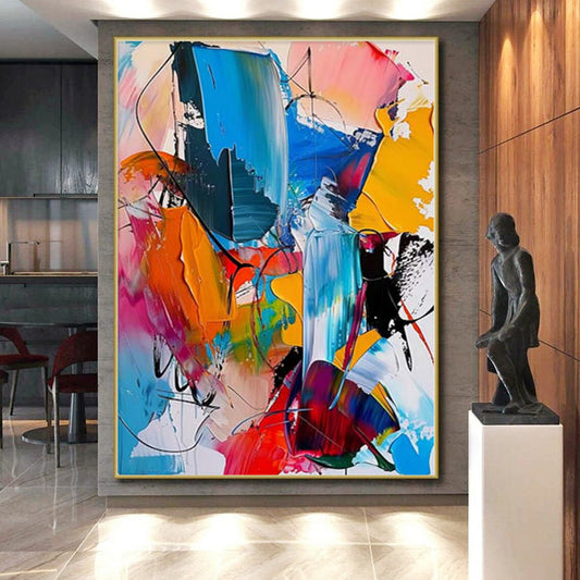
How to Choose Red Abstract Art Without Setting the Room on Fire
Red is the color that looks decisive on a phone and loud on a wall. A brick field can warm walnut and cream. A fire-engine slab can make a living room feel like a sale banner. The job is not to “add passion.” It is to decide how much heat the architecture can take.
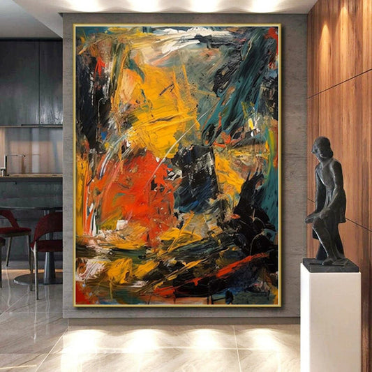
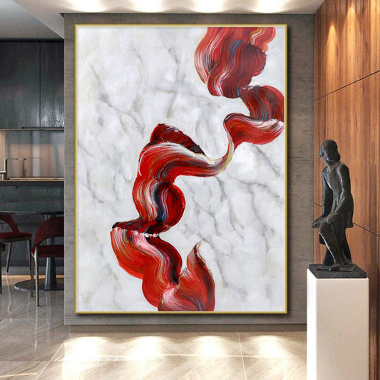
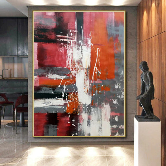
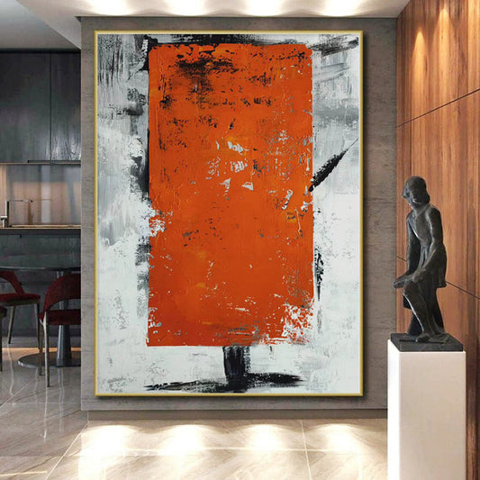
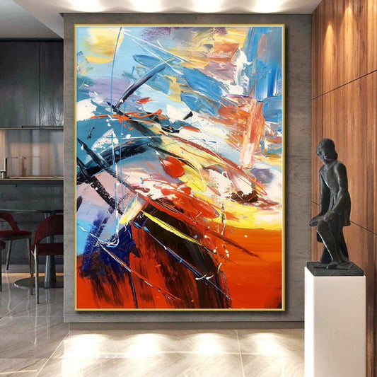
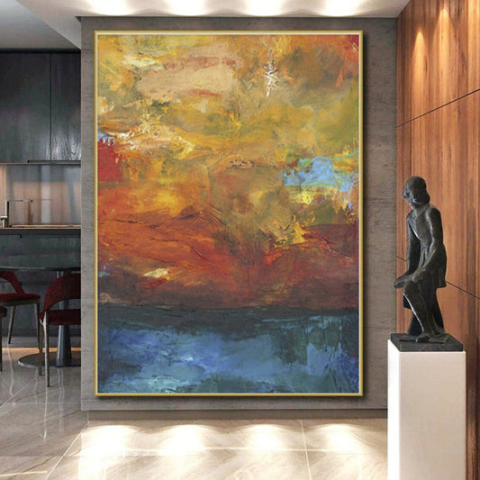
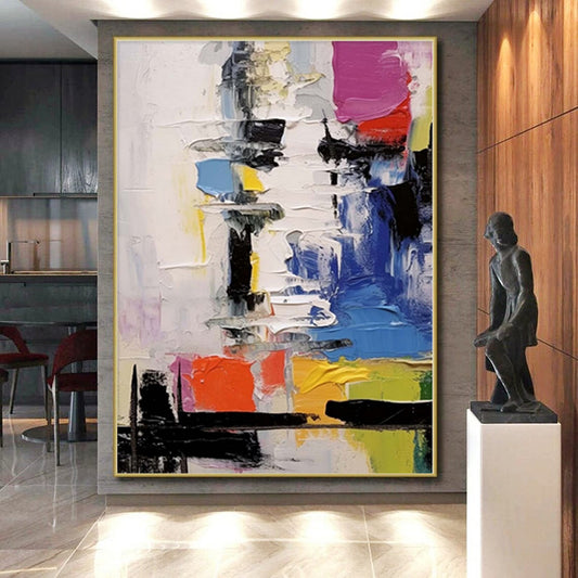
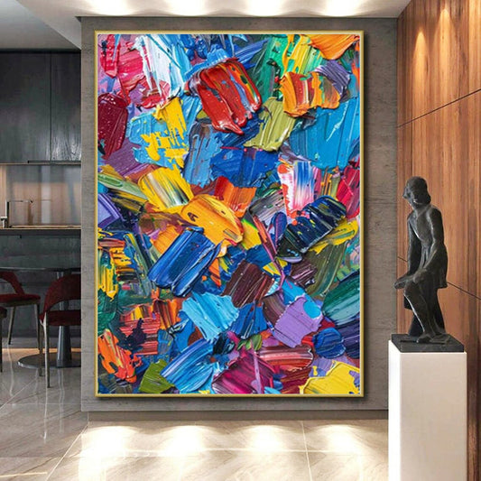
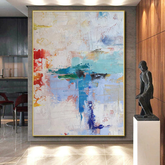
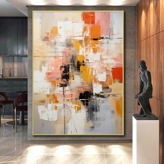
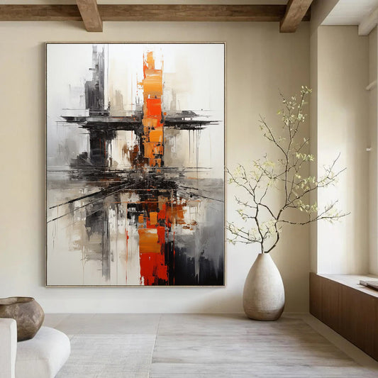
Look through BigArtify’s Red Abstract Art after you name the red and check the late-afternoon light. West windows raise saturation. What looked like wine at noon can read as neon at dinner.
What red has actually been in paint
Painters never had one red. Red pigments run from iron-oxide earths to bright mineral scarlets. Vermilion—historically ground from cinnabar—is the orange-red that dominated European easel painting for centuries; later studio reds often shifted toward cadmium for opacity and lightfastness. Earth reds (ochre, oxide, Venetian) stay closer to clay and rust. Those two families still split a shopping grid: dirt-red versus signal-red.
Large modern fields of maroon and dark red have another lesson. Tate’s display of Rothko’s Seagram Murals is useful even if you never want a chapel: the reds that hold a room are often somber—maroon, wine, black-red—not a single screaming primary. Scale and dusk matter more than the word “fiery.”
Name the lean before you buy:
- Brick / oxide. Earth, a little brown. Fits oak, cream, iron.
- Rust / burnt scarlet. Orange-red. Fits brass and camel; hot next to terracotta.
- Wine / maroon. Blue or brown in the dark. Easier in dining rooms and studies.
- Cadmium / signal. High-chroma true red. Only on a quiet, light wall.
- Ink-red / near-black. Needs chalk or sand so it does not become a void.
If the thumbnail looks like a fire extinguisher, keep scrolling.
Heat, contrast, and the rest of the room
Red competes with every other warm thing: cherry wood, rust pillows, copper pots, orange art. Count them. Two rusts and a brick canvas is a theme. Let the painting be darker, cooler, or paler than the furniture.
Contrast still decides whether the piece survives dusk. Mid-red on a greige wall in a north room is a stain. You need a light the doorway can see—chalk, fog, warm sand—or a wall light enough that the red can detach.
Texture multiplies chroma. Knife ridges in pale pink-grey catch sidelight and keep wine fields from going flat. The same ridges in pure cadmium make the wall flicker. Gold leaf on red is easy to overdo; a thin line on maroon can work with brass. Speckles on fire-engine red look festive.
Rooms
Living room. Brick or wine on a light wall, sofa in oatmeal or leather. A red sofa plus a red canvas needs a large value gap.
Dining room. Wine and maroon like evening lamps and wood tables. Signal red at head height can feel like branding.
Bedroom. Prefer maroon and oxide, low contrast. High-chroma red behind a bed is not rest; it is a second screen.
Office. A contained wine field or brick geometry. Full cadmium behind your head dominates every call.
Do not hang red art on a red or orange wall. Warm white, pale sand, or a cool greige gives the hue an edge. Cherry floors plus cadmium plus brass is how rooms overheat.
Size
Red reads larger than sage of the same dimensions. Do not automatically upsize “for impact.” Use about two-thirds of the sofa width, 60–75 percent of an open wall, and 6–10 inches above the cushions. On a high ceiling, height matters; a short scarlet slab under a two-story void looks like packaging.
Custom size is worth it for odd niches. Keep the family when you recolor. Brick to wine is a shift; brick to rainbow plus gold is a different painting.
Checklist
- Red named: brick, rust, wine, signal, or ink-red.
- Warm objects in the room counted.
- Afternoon sun tested; chroma dropped if the wall faces west.
- Light and dark still visible at dusk.
- Wall ground lighter and quieter than the canvas.
- Width set by furniture, not by the word “igniting.”
Red abstract art earns its keep when it still has air after the first week: a climate of oxide or wine, not a permanent alarm.
Is brick red the same as bright red abstract art?
No. Brick and oxide have brown or clay in them and sit with wood. Bright or cadmium red is a signal color; it will be the loudest object on the wall. If you want warmth without a poster, start with brick or wine.
Will red art make a small living room feel aggressive?
A full fire-engine rectangle can. A wine field with chalk, or brick marks on sand, often warms a small room. The aggressive feeling comes from high chroma plus other warms plus a canvas run edge to edge.
Can I hang red abstract art above a red sofa?
Only with a large value or temperature gap—much paler marks, or a cooler maroon against a warmer sofa. Same-depth red on red looks like one block of upholstery.
Is red abstract better in a dining room than a bedroom?
Usually. Evening lamps and conversation can take wine and rust. Bedrooms do better with darker, duller reds and lower contrast. If you want rest, do not buy the most saturated thumbnail.
How is this different from brown or gold-leaf collections?
Brown is earth without the alarm. Gold leaf is metal on a field. Red is heat. A rust canvas can sit near brown art if one is clearly darker. Gold on bright red is usually too much metal plus too much chroma; gold on maroon is the safer pair.
Does west light change a red painting?
Yes. Afternoon sun pushes brick toward orange and cadmium toward neon. If the wall gets late sun, choose wine or oxide and keep a pale ground. Recheck the piece at the hour you actually use the room.